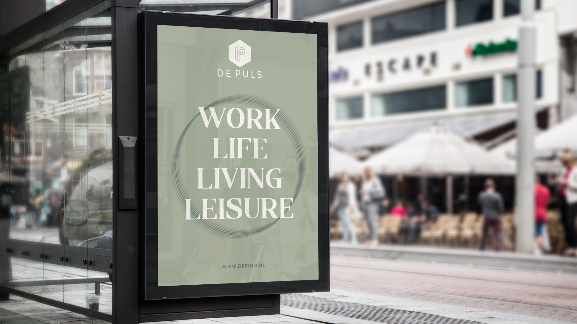
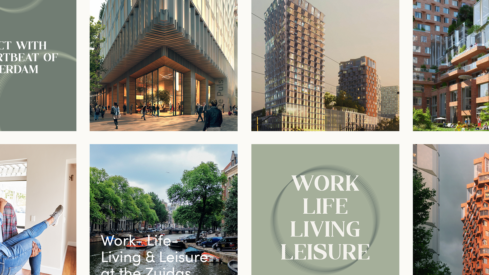
De Puls
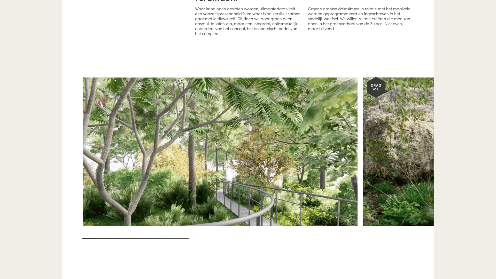
“De Puls is a sustainable urban biotope on the Zuidas. The higher you go inside De Puls, the more the accent shifts from people to plants and animals. On the ground floor on the south side of the building the municipality is creating a park and in the middle section between the two towers there will be a green roof garden.”
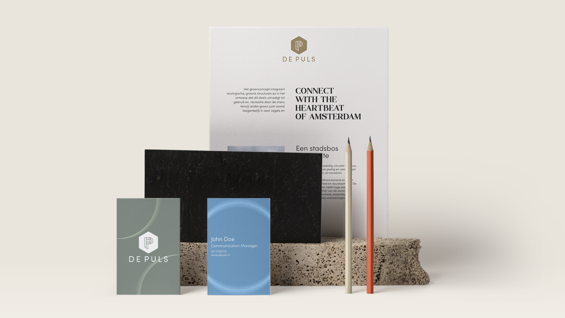
Brand identity
Together with Boomerang I have been working on a brand new identity for De Puls. The identity is based on the design principles: vibrant, accessible, creative, honest and proud.
The logo
From an architectural point of view De Puls has a lot of unique features. So this was a very inspirational starting point to create a logo that showcases the building and aesthetics and purposes. For the hexagon shape we got inspired by the unique brick orange balconies. Creating that sense of community and living together. The iconic two towers are visualised with the double “P”. De Puls is not only a home for humans but also for flora and fauna. Intertwining strokes at the top of “P” gives that organic feeling. Finishing off with a little tweek at the “u”. This way the brandmark and wordmark are visually connecting.
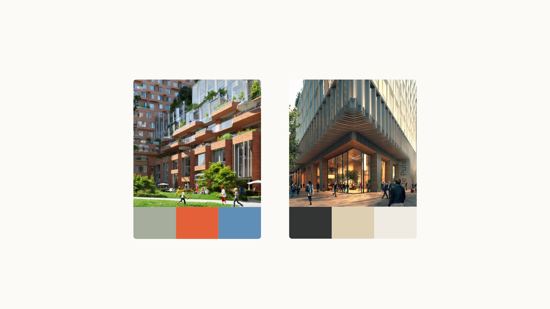
Colors
Imagery of De Puls itself was used as a foundation to hand pick the primary colors. Each one represents one of the main topics: work, life, living or leisure. Next to that each primary color is supported by a secondary color from the analogous spectrum to create harmonious contrast. As a whole it breathes an earthly, sustainable, warm yet modern classy feeling.
Typography
It’s a combination of a modern Sans-serif for good readability. Combined with a more serif and historical font. Used as a wink for the “Amsterdamse School” style and vibrant feeling.
Date